
& REPEAT
& REPEAT
BRIEF: How could &Repeat better support their client Panini Internazionale in branding and communication about the pant solution and the positive impact for their guests, and the planet? Since packaging always follow the consumer all through the customer journey, we believe it is crucial to communicate on pack.
SOLUTION: The biggest problem we identified was that the QR code (which the whole system depends on) wasn’t being noticed and no one knows what &Repeat actually does. In our solution we made the QR code more distinct and gave the visual identity a lift by adding humor and clearer information about their cause.


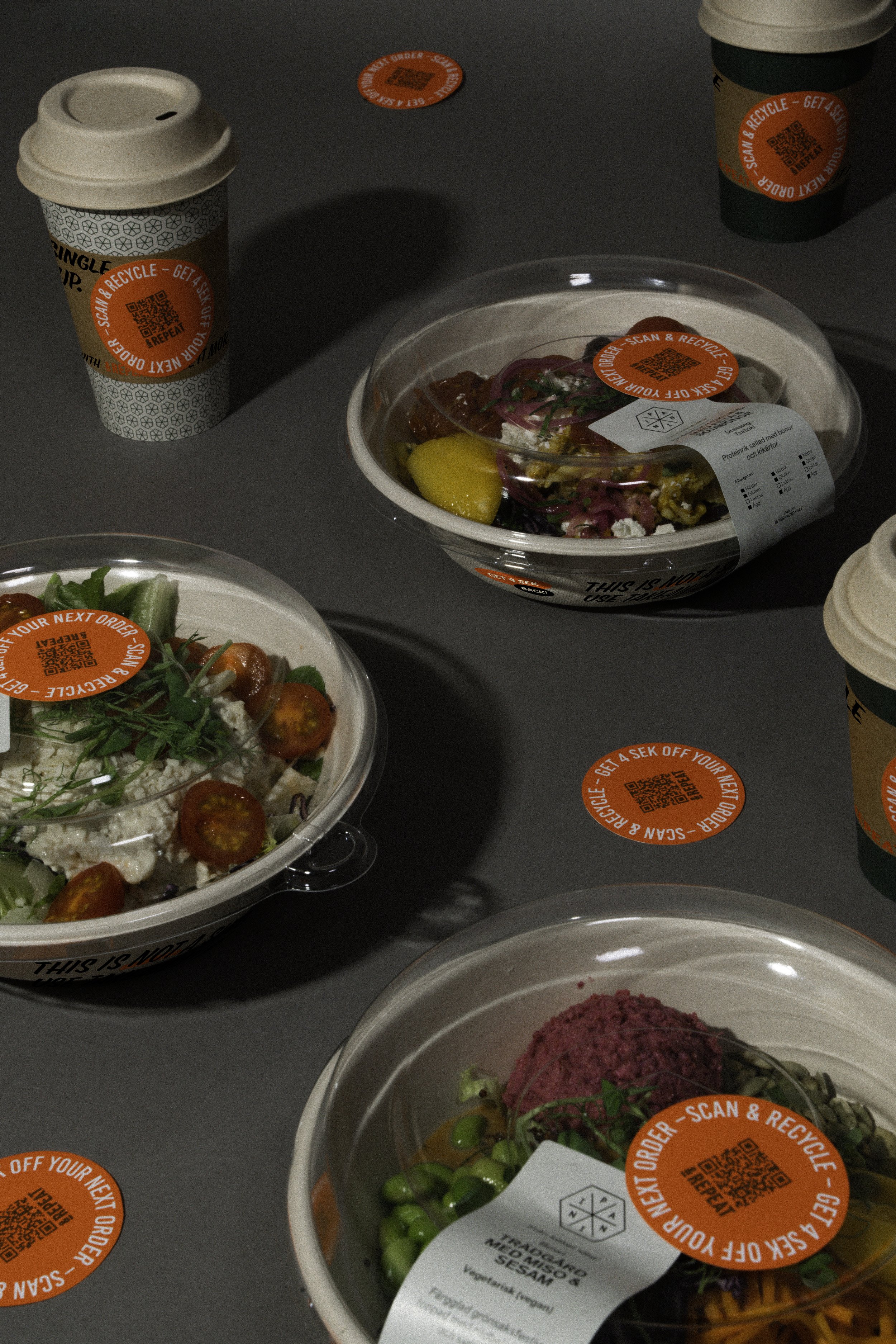


“This is not a single use cup”, because it has many more lives to live if you give it the chance to resurrect! We printed the bowls and added a sleeve for coffee cups. By making the stickers a strong orange, it’s hard to not notice them and read what it says. You can actually get money back by scanning the code and recycling the product, so it’s information you don’t want to miss. The font is inspired by classic grocery store ads to associate to food.


This project was created with Matilda Westin Bergh, during the course Brand Packaging.