Pro Rata
Client: Pro Rata
2025
Pro Rata empowers small and mid-sized listed companies with a unique blend of financial guidance, legal expertise, and investor communication, strengthening their position, saving time, and building confidence.
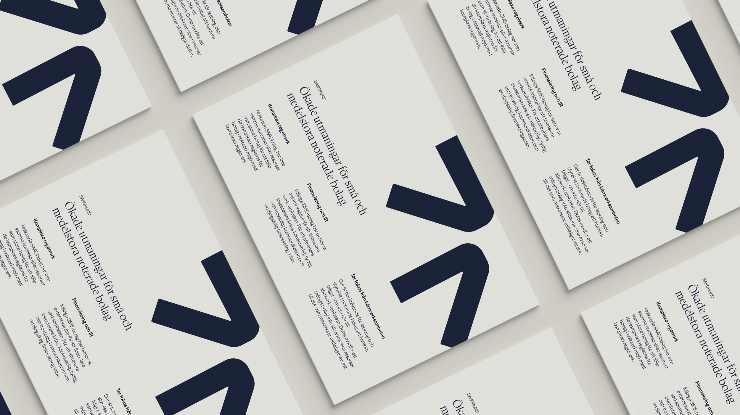
The new visual identity reflects the company’s three business areas, with the converging arrows continuing to represent how Pro Rata simplifies its clients’ journey to the stock market. The color palette retains its grounded, earthy tones, while the symbol strengthens Pro Rata’s recognition within the industry.
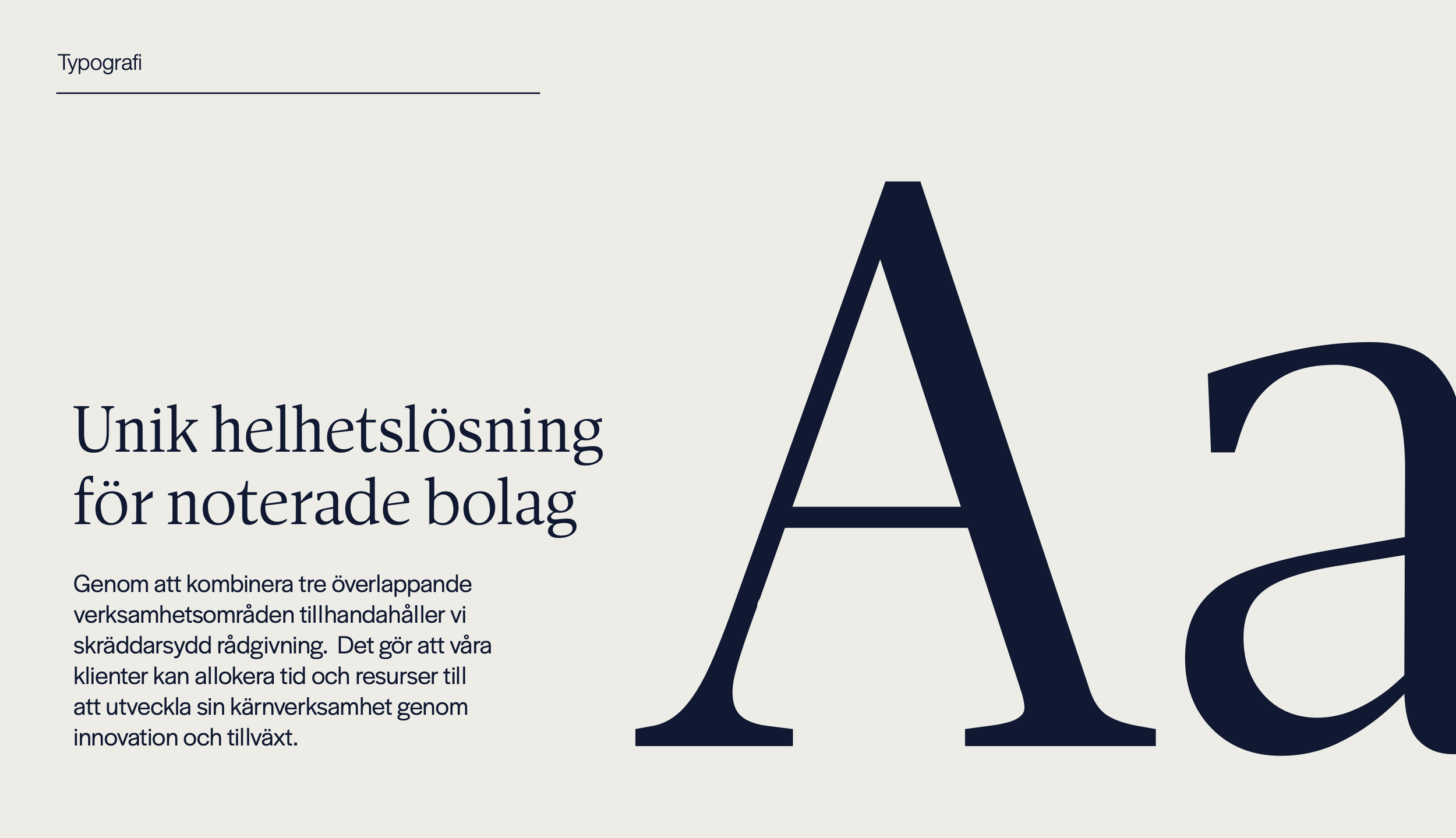
The typography follows a classic standard with high readability. The headline typeface is an elegant serif with strong contrast, conveying a sense of seriousness and sophistication. At the same time, its refined flow and detailed features lend the brand a distinctive character. For body text, a clean sans serif typeface is used, offering excellent legibility and a wide range of weights. This pairing balances tradition with modernity, ensuring a professional yet contemporary impression.